151013 Tues.
As far as a designer is concerned, we all know that colour in design is very subjective. With colours, we can set a mood, attract attention, or..make a statement. We can use colour to energize, or to cool down. By selecting the right colour scheme, we can create an ambience of elegance, warmth or peace. Colour theory is a science in itself. (Sir Issac Newton was one of the first scientists to investigate colour theory.) Sometimes, something as simple as changing the exact hue or saturation of a colour can evoke a completely different feeling. Wondering what is hue? Saturation? Keep scrolling. :)
Hue
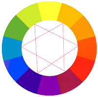
- A hue is any colour on the colour wheel.
- Hue defines pure colour in terms of "green, blue, red".
- Hue also defines mixtures of two pure colours like "red-yellow, blue-violet".
- Hue is the name of the colour.
Value
- Value is the lightness or darkness of a colour.
- All hues can be made in all values.
- Adding white paint will make the pigment lighter; adding black paint will make most pigments darker.
Saturation
- Saturation can also be called a colour's intensity.
- A saturated colour is high in intensity, it looks rich and full.
- A unsaturated colour is low in intensity, it looks dull and grayish.
Secondary Colours
- Secondary colours are the colours formed by mixing two primary colours.
- Yellow + Red = ORANGERed + Blue = VIOLETBlue + Yellow = GREEN
Tertiary Colours
- Tertiary colours are the colours formed by mixing a primary and a secondary colour.
- Yellow + Orange = YELLOW-ORANGE
Red + Orange = RED-ORANGE
Red + Violet = RED-VIOLET
Blue + Violet = BLUE-VIOLET
Blue + Green = BLUE-GREEN
Yellow + Green = YELLOW-GREEN
Analogous Colours
- Analogous colours are colours that are next to each other on the colour wheel.
- An analogous colour contains one primary colour, one secondary colour and one tertiary colour.
- e.g. Yellow, Yellow-Orange, Orange
Tint
- A tint is a colour produced by the addition of white.
- The more white added, the lighter the tint.
- Tints are also known as pastels.
Shade
- A shade is a colour produced by the addition of black.
- The more black added, the darker the shade.
Monochromatic Colours
- Monochromatic colour schemes use a single hue (purple above) and then use various tints and shades of that original colour.
- They are very low in contrast.
Warm & Cool Colours
- The colour wheel also visually illustrates colour "temperature": warm vs cool.
- Vivid hues that bring about a sense of warmth are labeled as warm colours. This includes hues from yellow to red-violet.
- Hues that generate the exact opposite feeling are called cool colours. They tend to be associated with cool temperatures and relaxation. This includes hues from yellow-green to violet.
Colour Symbolism
1. Royalty
- The colour purple has been associated with royalty, power and wealth for centuries.
- Purple was the colour worn by Roman Emperors and magistrates, only wealthy rulers could afford to buy and wear the colour.
2. Freshness
- Green is the colour of nature and represents growth, harmony, freshness, hope and fertility.
- Green has great healing power and it is the most restful colour for the human eye, it can improve vision.
3. Passion
- Red is the colour of fire and blood.
- It is associated with energy, war, danger, strength, power, determination as well as passion, desire and love.


