Saturday, 31 August 2013

Assignment 2: Rule of Thirds

270813 Tues.
Here comes our second assignment of Principles of Design. :D

Assignment 2:
  • Select a subject matter of your liking i.e. door/ window/ bottle/ cup/ bin/ shoes/ eye/ food etc.
  • You will need to hold/ stick your frame in every shot as your 'view finder', using it to compose/ crop your shots.
  • It is OK to take a photo with your hand or fingers in it.
  • Shoot at least 50 shots to select 30 photos and create a short movie clip using a software of your choice.
  • Give your work a nice title, and you may be creative and add subtitles or narration to make a story.
  • Be sure to add your name and ID number at the end credits.
Before this we were asked to bring a 12 by 9 inches mounting board (leaving 1/2 inch on each side) as our 'view finder'. The purpose of the 'view finder' is to help us to understand the composition of an image based on the RULE OF THIRDS.

What is rule of thirds?
The Rule of Thirds is a guideline which applies to the process of composing visual images. It works like this: imaginary lines are drawn dividing the image into thirds both vertically and horizontally. Important elements of the composition are placed where these lines intersect. For example:

Friday, 30 August 2013

Composition & Design: Principles of Design

270813 Tues.
As a (future) designer, what we think about design usually has a direct impact on how we design. The principles of design is actually what we do to the elements of design. "How we apply the principles of design determines how successful we are in creating a work of art." -- John Lovett

1. Unity & Variety
  • Unity: creates a sense of harmony and wholeness, by using similar elements within the composition
  • Variety: adds interest, by using contrasting elements within the composition

2. Balance
  • These two pictures are balance.
  • A large shape close to the center can be balanced by a small shape close to the edge.
  • The darker the shape, the heavier it appears to be.

3. Scale & Proportion
Scale
Proportion
  • Scale is the real size of an object seen in relation to other objects, people, its environment or the picture plane.
  • Proportion is the size relationship of parts to its entire work, and each to the other.

4. Hierarchy (Focal point/ Dominance)
  • Dominance is about the focus given to a part of artwork.
  • Dominance can be applied to one or more of the elements to give emphasis.

5. Rhythm & Repetition
  • Repetition is the use of similar or connected pictorial elements. e.g. similar shapes, colours or lines that are used more than once.
  • Repetition can create rhythm.

Composition & Design: Elements of Design

270813 Tues.
As far as design is concerned, there are many different types of elements that we, as a (future) designer can play with :) According to wikipedia, design elements are the BASIC unit of a painting, drawing, design or other visual piece, which include:

1. Line

  • Line can be straight or curved, heavy or light, soft or hard, or a mixture of them all.
  • Line can show movement, rhythm, textural results and even emotional effects.


2. Shape
  • A shape is created when a line crosses itself or intersects with other lines to enclose a space.
  • Shape is 2-D, it has height and width, but no depth.
  • Geometric shapes: circles, squares, rectangles, triangles.
  • Organic shapes: leaves, seashells, flowers.


3. Texture
  • Texture is the surface quality of an object.
  • Implied texture: 2-D art that is made to look like a certain texture but in fact is just a smooth piece of paper. e.g. A drawing of a tree trunk may look rough but in fact it is just a smooth piece of paper.
  • Real texture: The actual texture of an object.


4. Space

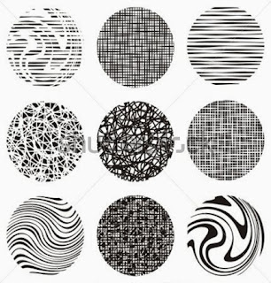
  • Positive is dark, negative is light.
  • The positive space is masked in black in the second photo.
  • The negative space is masked in black in the first photo.

5. Time & Motion
Type Me Again Peter Cho, 2000
  • Any word or image that moves functions both spatially and temporally.
  • E.g. carefully watch water, it's moving, splitting, falling apart and getting back together.


6. Colour

  • Description: Hue - movement within colour, Value - colour intials, Chroma - brightness
  • Schemes: Primary, secondary, tertiary, monochromatic, complimentary, etc.


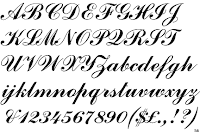
7. Typography
Serif vs San serif
Commercial Script

Custom

Square Serif

Wednesday, 21 August 2013

Surrealism: Presentation

200813 Tues.
[Well well in order to achieve so called FUN YET EDUCATIONAL, I shall start making my post not that SERIOUS as possible lol. :b]

This was our first OFFICIAL presentation for Principles of Design. The previous one was just an "appetizer" so that we could be more familiar to each other. :x Well seriously there is one thing that makes us design student PROUD, that is: we don't need to wear formal attire for presentation (well except for English). I know you're envy. 8D

Alright back to the topic. Among all my 5 sketches, Ms. Lisa has chosen the 4th one for me. The simple reason she gave was she could see me in that particular sketch. [Please refer to Surrealism: Sketching for further information. ;) ] To be honest, this is my favourite sketch among all as well. :)

So this is me, faking a smile, doing the work that I supposed to do, QUIETLY.
I used poster colour for most of the painting, except the curtains were made of paper. I wanted to find some pretty nice maroon-coloured fabrics but somehow I ended up using colour paper. I spent two nights colouring the background. It wasn't as easy as it looked like because of all those tiny tiny little things, such as the gears, octopus's legs and the ballerina's skirt. The whole picture was painted in high contrast in order to emphasize the strange and uncommon atmosphere in the circus: the colours of the background were extremely dull, the characters were very brightly painted instead.

The theme of this painting is "Hear no evil, see no evil, and speak no evil". I'm not a cute girl. I don't like to please others. But there is one thing I like about myself: my work speaks louder than words, I don't boast. This world is nonetheless too materialistic, sometimes we just can't do whatever we want. In order to survive, we mask ourselves. We cover our ears like we are deaf, cover our mouth like we can't talk, cover our eyes pretending the world is still lovely and beautiful.


Oops sorry still too emo I guess :/
Looking forward to the next assignment. :)

Wednesday, 14 August 2013

Surrealism: Sketching

Our very first assignment of Principles of Design is to:

  • Research on an art movement that you feel represents you the best. √
  • Design a self-portrait based on that particular art movement.
  • You must be able to understand and capture the essence of the genre selected.

The first part is done and I've blogged about it on my previous post. Well as for reason, why among all the 15 art movements given I chose Surrealism, it's simply because Surrealism is ONE OF A KIND. Unlike other art movements for instance Realism, Rococo and Renaissance Art, Surrealism is not object-fixed, it defies all LOGIC. In other words, Surrealism is INFINITE .

So here comes the second part. These are the sketches I did to represent the art movement. :)

"Grown ups are complicated creatures, full of quirks and secrets." -Roald Dahl

This is a picture of a girl in her dreamland. Although I'm not a kid anymore, I miss and I really enjoy playing all the games in amusement park, especially the roller coaster. The girl's hair is lengthened to form a cliff, and the circus and roller coaster are built on the cliff. This symbolizes my hesitation and struggle as adults who like children's games are normally seen as pathetic and weird. But there's nothing wrong playing in fun fair, is there? Since life is full of reminders that can remind us of almost most of our unsolved problems which cause our mood swings often, fun fair usually reminds me of my good childhood days, it helps me to temporarily escape to my sweet past. Admit it, you just don't wanna grow up.

"We all wear masks, and the time comes when we cannot remove them without removing some of our own skin." -Andre Berthiaume

A persona, in the word's everyday usage, is a social role or a character played by an actor. The word is derived from Latin, where it originally referred to a theatrical MASK. We all behave fake because this is part of being human. We long to be a part of a community. We therefore modify our behaviour to conform with different social situations. Part of the deal we make with society is that in order to get the benefits of society. We act differently because certain people or situations make us have to act that way, you don't always get to do what you want to do. 

"Paris is the city of love, even for birds." -Samantha Schutz

Trust me, every girl longs to go to Paris, the city of love and lights, the most romantic place on earth. Paris is indeed the perfect setting for a romantic moment because its beauty strikes you at every corner, with its elegant yet impressive architecture as well as the subtle combination of art, history and nature. This is my portrait with the background of Paris's scenery. What girl actually wants is absolutely simple: having a great time with her beloved looking at the Eiffel Tower, drinking coffee at sidewalk cafes and perhaps just walking hand in hand.

"Hear no evil, see no evil, and speak no evil." -Japanese proverb

Is hypocrisy the canker of our society? Unfortunately it is a yes. This picture symbolizes our hypocritical society. The background is set as the circus, an originally pure and innocent world for kids. However, instead of bringing happiness for people, the whole area is now penetrated with terror, sadness, fear, discomfort and great curiosity. A sweet-looking ballerina is cracking her whip on the poor deer. Beneath her cute exterior, she's very cruel and evil. On the other hand, the cute little bunny, trying to smile innocently but holding weapons on both hands, underneath its kindhearted manner, it's very dangerous as well. These are person who mask themselves enmity under an appearance of friendliness. The baby-faced monkey, looks extremely frightened while wirewalking on the tightrope represents young people who just stepped into the world, feeling helpless and afraid. The bird, which supposed to be a monkey as well, has fully displayed the meaning of this proverb. It closes its eyes, pretending the world is still lovely yet peaceful. And me, as a freshman, trying my best to enjoy myself in this dramatic world.

"We don't see things as they are, we see them as we are." -Anais Nin

This is ONE portrait seen in TWO angles. What I'm trying to tell is: things are often not as they first seem, and there's almost always a different perspective. We tend to view things not as they truly are, but in the  context of our own personal preconceived notions and prejudices. We look at situations and interpret what others say and do according to our own set of past experiences. The meaning we give events, the way we make sense of our world, is based on our set of core beliefs. In fact, not only this portrait, sometimes you need to look at life from a different perspective. :)

Monday, 12 August 2013

Surrealism: Research

SURREALISM(1924-1945)is a 20th century style and movement in art and literature in which images and events that are not connected, are put together in a strange or impossible way, like a DREAM, to try to express what is happening deep in the mind.

The surrealist movement flourished in Europe between World Wars I and II. Surrealism grew principally out of the earlier Dada movement, which thrived before World War I (Dadaism: an early 20th century movement in art, literature, music and film which made fun of social and artistic conventions). If Dadaism produced a committed socio-critical style of painting in Germany at the beginning of the 20th century, artists in France transformed the Dadaist principle of the illogical, the irrational and the random in their painting, in order to reunite the conscious and unconscious realms of experience completely. They too no longer believed in visible reality, and were in search of an all-encompassing reality, a 'super-reality('sur', Fr. 'over, super'). Surrealism did not remain restricted to visual art, but found literary form as an 'attitude towards reality', that the world of dream and fantasy would be joined to the everyday rational world in an absolute reality, a 'SURREALITY'.

The conviction that alongside the visible world there exist repressed areas of experience which can be called forth in dream images or hallucinatory phenomena and pictorial suggestions, linked an international movement of artists - visual artists and writers - in spirit. Their outstanding painter-figures were the Spaniards Salvador Dali and Joan Miro, the German Max Ernst, the Belgian Rene Magritte, the Greek-born Italian Giorgio de Chirico and the Mexican Frida Kahlo, to name but a few. In very different ways, they explored the realms of the Surreal artistically, but they were always concerned with 'replacing the real outside world with the reality of the mind'. 


Giogio de Chirico, The Great Metaphysicist, 1916.
Giorgio de Chirico tried to break through the consciousness-governed thought processes with a tension-laden, irritating world of imagery, painting highly unreal pictorial situations in a realistic manner. De Chirico named his works, in which supernatural forces seem to prevail, 'pittura metafisica' - 'metaphysical painting'. The Surrealists received crucial stimulation from the enigmatic magic-realist paintings that de Chirico painted as early as the first decade of the century.

Salvador Dali, The Persistence of Memory, 1931.
For Dali, clocks, normalised instruments of measurement, represented the reality principle, while soft, 'edible' objects belonged to the pleasure principle. Dali's paintings show a connection between the perception of time and the perception of space. The clocks, flowing through space and time, prompt thoughts of the 'flow' of time, and give the impression of a time and space of memory dissolving into the distance, a zone invaded by the inexplicable, and one which unconsciously influences the experience of the present.

Rene Magritte, This is not a pipe, 1928-29.
This is Magritte's famous depiction of a pipe beneath which he wrote 'Ceci n'est pas une pipe - This is not a pipe' (but only the picture of a pipe), he wanted to prompt a thought process in the viewer, at the end of which his understanding of the world would have changed. For Magritte, painting was primarily an 'art of thinking'. With his confusing pictures, the painter called the relationship between appearance and reality, between painting and depiction, into the consciousness.

Rene Magritte, The Realm of Light, 1954.
Magritte questioned and shook the foundations of the order of things in his art. Dead objects have eyes, reflections disappear, nocturnal streets are spanned by bright day-time skies. The world seems to develop holes; the safety of orientation and the reliability of the familiar disappear. In many pictures Magritte achieved this effect by means of surprising combinations of objects whose materiality or scale has been transformed. Between these objects flashes a 'poetic spark', as the Surrealists put it, which means that the accidental, the sudden and absurd inspiration is invested with inexplicable meaning. A similar thing happens with Magritte's titles: they are Surrealist in that they have nothing whatsoever to do with the images. But associations sometimes help to span fleeting bridges over the emerging chasm.


References: Anna C. Krausse, The Story of Painting From The Renaissance To The Present, 2005

Monday, 5 August 2013

First Presentation :D

300713 Tues.
That was our first lecture of Principles of Design, lectured by Miss Maslisa.

Our first lesson was about identifying ourselves. As a designer-to-be, I agree that understanding ourselves is extremely important as we need to figure out a way or a style that suits us the most to present our artwork. We put in effort and emotion to make sure that our work is infused with life as well as feelings, instead of a regimented one. However, we didn't seem to know ourselves very well. We were therefore told to draw a mind map and also a self-portrait in order to start us thinking, wondering and comprehending ourselves. We were given two hours to do so, and after that what we needed to do was to present them in front of our course mates :)
This is my personal mind map :)
I separated my life into 9 columns, well you can also say these're the spaces in my brain haha :p So overall they're things which I like and I don't, things that I'm afraid of, my D.O.B, my hobbies, my hometown and etc. I divided my mind map like this also showed that I'm a neat person and perfectionist. Well at least I think I am :p Nevertheless, Miss Maslisa said these were just things on the surface. Still I didn't really get to know myself internally. One of my course mates, Vanessa did a very good job indeed. She didn't only talk about the surface but also her personalities, we get to know more about her now. Her confidence while presenting really impressed me *thumbs up* :)

And this is my self-portrait :) Seriously it can only be seen in this angle!! >_<
Our assignment is to design our very own self-portrait. One day, I would be able to speak as fluent and confident as Vanessa.

We need to work hard to shape our lives in such a way, so that in the light we'll reflect, and form our very own uniqueness. :)