031213 Tues.
So here comes our very last assignment for Principles of Design: a group project based on colour theory (how time flies! >_<). We had chosen "Carnival" as our theme and our group, led by Jessy, formed by me, Yueh, Michelle, Assel, Pei Yan and the only boy Bryan eventually decided to go with
ferris wheel. :)
 |
| This is the basic idea of our ferris wheel which contains 8 colours: Red, orange, yellow, green, blue, purple, violet and pink. |
Since we would be having an exhibition for this final project, just like a real carnival, all items need to be
BIG BIG BIG!! We were quite confused about the size, the height, the width of our ferris wheel at first @@ We eventually decided to make it 10 feet tall and we really hope that we could achieve it.
 |
| The height of our ferris wheel would be 10 feet and the width would be 7 feet in total. :) |
We were all super excited and confident at first during the group discussion. :p However I'm afraid I have to say we were wrong, totally wrong. Building a
10 feet tall object was absolutely,
NOT EASY. Our biggest challenge as well as fear was actually how to prevent it from falling. Since the year is ending the wind would be really really strong. We cannot use something too light like carboard nor something too heavy like iron. As this is an happy carnival none of us would like to see any accident happen. >_< After another brainstorming, we came out this idea:
 |
| We planned to use wood for the base, motor rim for the center and pvc for the wheel. |
 |
| We bought 2 second-handed motor rims which costed us less than RM 20 for two. The diameter of one motor rim is almost 18 inches. The steel used to hold 2 motor rims together was recycled object, we took it from a factory. All the PVC were welded to the motor rim they were therefore super stable no worries ^_^ As welding need license, we found professionals to help us to do the welding part. |
 |
| Although most of the materials were recycled items, we still needed to buy PVC pipe for the wheel. These are the receipts haha XD |
 |
| Our leader Jessy (right) and Yueh (left) were cutting the PVC pipes. :D |
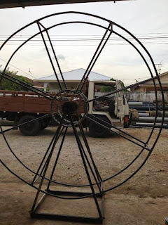 |
| This was the structure of our ferris wheel! We eventually used steel to replace wood for the base(also recycled). In order to make the pipes curved, we put them into boiled water. Since we were beginners and not that skillful, we failed quite some times and the wheel was not perfectly curved. >_< |
 |
| Here comes the spraying part! We bought a pail of white paint to spray. :p |
 |
| When the structure was done, it's time to do the "lanthern". We did them at Yueh's house. :) |
 |
| We used cardboard to make the lantherns at first, but they looked very unstable and ugly. One day before the final presentation, we suddenly pop out this idea: change the cardboard by using mounting board. Mounting board was harder to cut compared to cardboard. But one of us cut one so we managed to finish them within one afternoon. Moreover, we added paper cutouts (which we learnt before from our previous assignment) to our lantherns. We put light bulb inside the lantherns so that the paper we cut could be shown beautifully when the lights were on. The paper cutouts were based on the theme Carnival as well, they are ferris wheel, balloons, merry-go-round, popcorn, clowns, bumper car, haunted house and roller coaster. ;) |
 |
| This is the process of our ferris wheel. A round of applause to our new born baby!! :D and YEEEEESH, IT CAN TURN!! :D |
 |
| The ferris wheel, and us. <3 :) (Photo credits to Danny.) |
This assignment was really fun and awesome. Our teamwork was just beyond compared, what I can only say is EXCELLENT! Well done everyone, we can't do it without any of you guys. This assignment has shortened the distance between us and made us closer than ever. Thank you Ms. Lisa and my group members! For everything. :') See you all next semester! ;)


